The client
CV. Fokus Usaha has sold building materials in Timika since 2015, from a shop on Jl. Yos Sudarso opposite Timika Mall in Papua Tengah. Plywood, gypsum, PVC and galvanised pipe, trapezoidal metal roofing, SNI-grade rebar, C-Channel and hollow sections, HPL, PVC roofing — around fifty lines across eight categories, sold to everyone from a household patching a roof to a contractor on a large project. Drinking water sits alongside it.
The line they lead with is Bersama Kami Membangun Papua, and in Timika that is a claim about supply rather than a slogan about sentiment. Materials arrive by ship and by plane, stock moves unevenly, and the only question a buyer really has is whether this shop has the thing, in the size they need, today. Everything else follows from answering it.
What we did
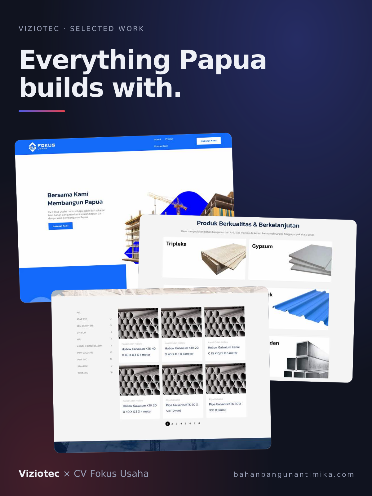
So we did not build a company profile with a catalogue bolted on the side. We designed the whole landing page as the catalogue. The page opens on the proposition, states the commitment to local infrastructure once, and then hands over to the products: eight category tiles — Plywood, Gypsum, Pipa PVC, trapezoidal metal roofing, Besi Beton SNI, C-Channel dan Hollow, HPL, Atap PVC — laid out to be scrolled rather than navigated. Every tile drops straight into the catalogue already filtered to that category, so a visitor who came for trapezoidal metal roofing reaches trapezoidal metal roofing in one tap from the front page, without opening a menu or learning the site's structure first.
That ordering is the whole design decision. A supplier's homepage usually spends its first two screens on the company and its last on the products, which is exactly backwards for a customer who is standing in a half-finished building with a list. Here the scroll is the browse. The about page, the vision and mission, and the certifications still exist for the buyers who want them — they are simply not in the way of the ones who don't.
It is built mobile-first, because in Timika the shop is reached by phone and ordered from over WhatsApp. The category tiles reflow to a single readable column, the product grid stays legible at arm's length rather than shrinking to fit, and the WhatsApp button follows the page down so the next step is never more than a thumb away. Every path through the site ends at the same place it ends in real life: a message to the shop.
The catalogue runs on a CMS the team updates themselves. Prices move, sizes go out of stock, a new line comes in on the next boat — none of that should require calling us, and it doesn't.