The client
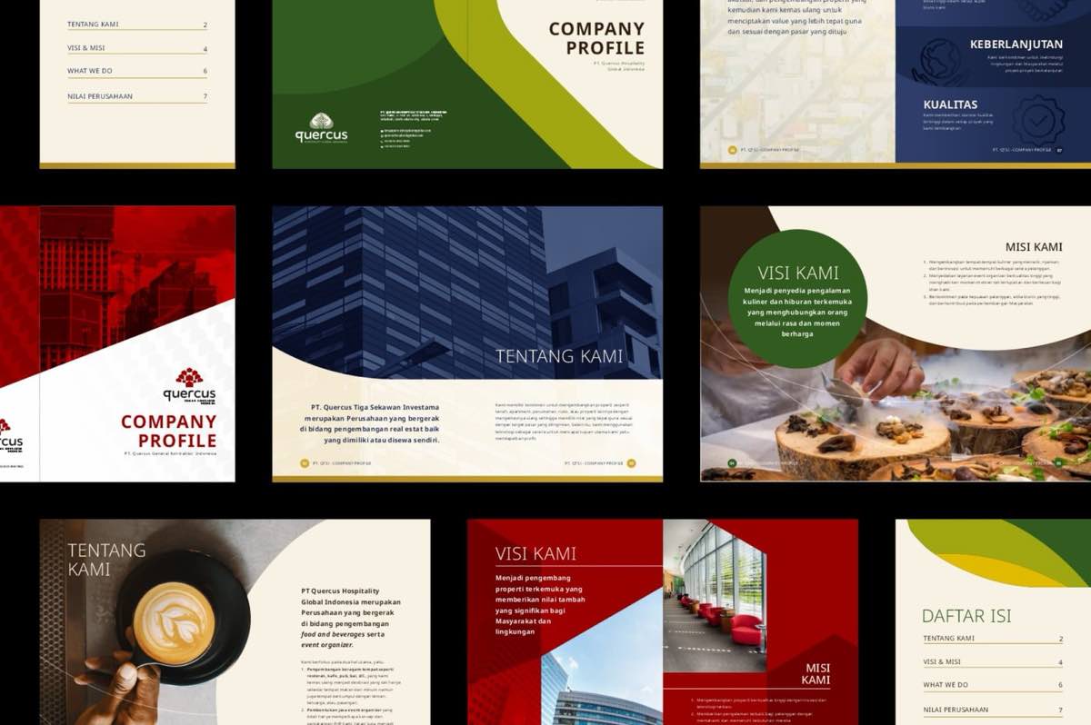
Quercus Group is a multi-faceted company made up of three subsidiaries with genuinely different businesses. PT. Quercus Hospitality Global Indonesia leads in F&B development and event management; PT. Quercus Tiga Sekawan Investama specialises in capital investment and property management; PT. Quercus General Kontraktor Indonesia handles real estate development and plumbing services.
What we did
Three businesses that different could easily have ended up with three unrelated logos. We built a single logotype that ties the individual brands together, then gave each subsidiary its own oak tree visualisation within it — the name Quercus is the oak genus, so the mark had somewhere honest to start. The result reads as one group and three distinct companies at the same time, which is exactly the thing a holding company needs its identity to do.