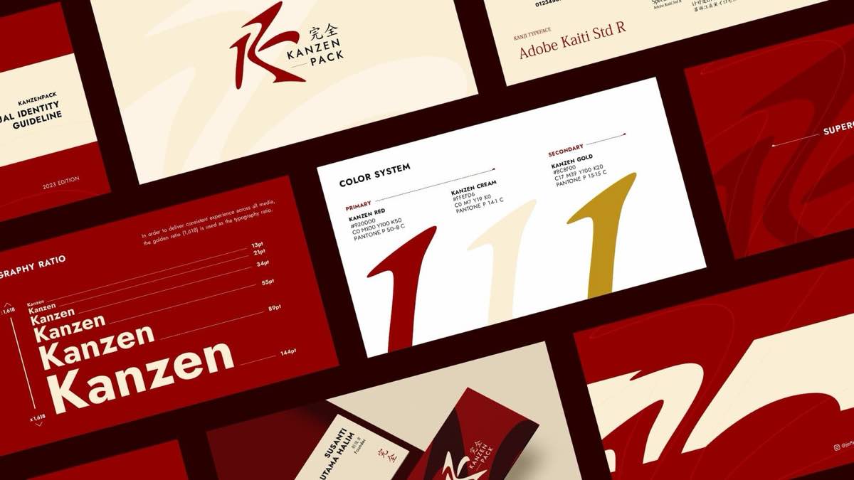
The client
Kanzenpack supplies packaging to businesses across Jakarta and Surabaya — boxes, kraft and specialty containers — under the line perfect companion for all your packaging needs. They run the model a lot of Indonesian suppliers run well: the catalogue lives on Instagram, orders come through a WhatsApp admin, and stock sits in two cities so delivery is short in both. The name carries the promise — kanzen is Japanese for complete.
What we did
A logo. That was the brief, and the whole of it. The mark needed to carry the Japanese reference in the name without tipping into pastiche, so we drew it from the stroke logic of Kanji — the weighting, and the way strokes enter and terminate — rather than borrowing any character outright. It had to hold at the sizes packaging is actually seen at: small, printed on board, sometimes in a single colour on a carton. Everything beyond the mark, they build themselves.